 Philip Terry Graham on Wikimedia
You don’t need your favorite team to rock a cool logo—but it helps. NFL logos do more than sit on helmets; they’re tiny flags for entire fan bases. A great mark has to read at full sprint, look sharp on a cap, and still feel timeless when style swings back around. We’re not usually ones to judge jerseys by their covers, but these are the coolest ones on the field.
Las Vegas Raiders
The Raiders’ shield-and-pirate combo is unapologetically bold, and that’s exactly what we love about it. High contrast, sharp lines, and that eye patch create a classic emblem that looks equally at home on a jersey sleeve or a biker jacket. It’s tough without trying to be trendy.
Philadelphia Eagles
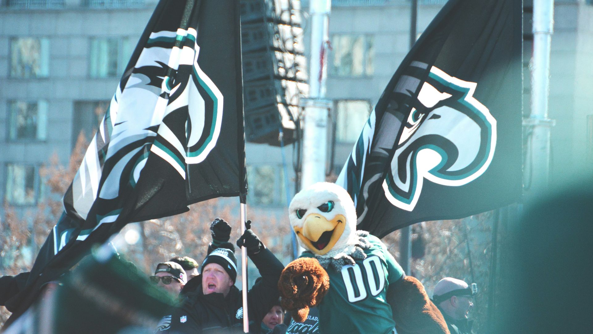
Rather than a cartoon bird, the Eagles go with a sleek, forward-tilted head that feels fast and focused. The hidden “E” shape in the feathers is a clever detail, too, and the silver-and-midnight palette keeps it polished without losing edge.
Seattle Seahawks
What’s this? Another bird? You betcha. Seattle’s logo is modern and angular, with a stylized head that’s instantly recognizable. The bright eye pop adds attitude, while the subtle Northwest-inspired geometry gives it character beyond the usual “mean animal” template.
Minnesota Vikings
With braided hair, a horned helmet, and a confident profile, the Vikings logo looks like it belongs on the cover of an ancient epic. The colors land between regal and rugged, and the design stays clean, even when it’s shrunk down to patch size.
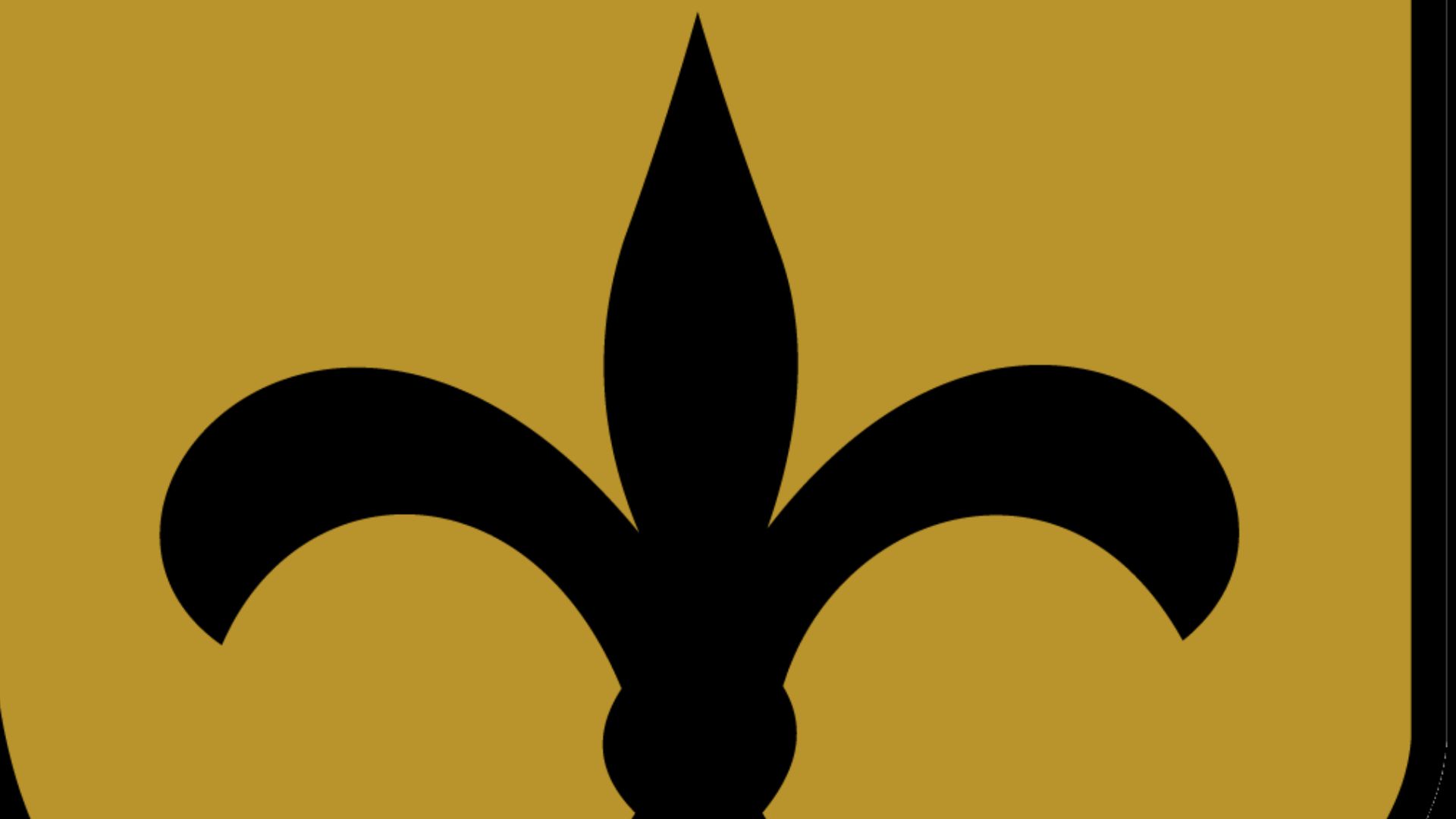
New Orleans Saints
 New Orleans Saints on Wikimedia
The fleur-de-lis is elegant in a way most football symbols don’t even attempt, and that’s why it works. Gold and black bring drama, and the silhouette is so strong you can spot it from far away and still feel a little fancy.